
Color isn’t just a design element — it’s a whole language. It captures attention, sets the mood, and communicates messages faster than words. Whether you’re designing a brand, a website, or an app, understanding color theory can make your work stand out and feel intentional.
In this guide, we’ll break it down in a super simple way — no jargon, just practical stuff you can actually use.
What Exactly Is Color Theory?
At its core, color theory is a framework that helps designers create visual harmony. It explains how colors interact and how they affect people’s emotions and decisions.
The team at NRewind Technologies uses color theory in every stage of design — from building eye-catching interfaces to crafting brand identities that resonate.
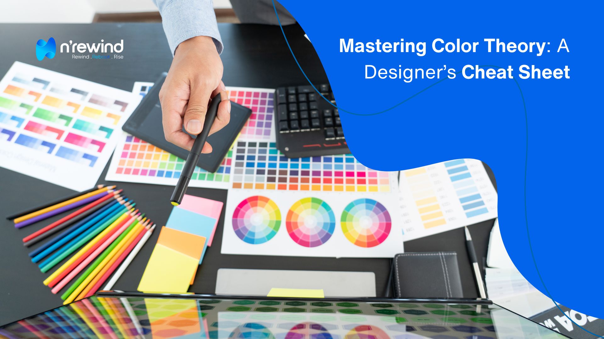
The Color Wheel: Your Design Foundation
The color wheel is your best friend when it comes to picking the right combinations. It shows how primary, secondary, and tertiary colors relate to each other — making it easier to build a solid color palette.
If you’re into branding, NRewind’s graphic design team builds custom color palettes that elevate a brand’s identity without overcomplicating things.
Color Harmony: Why Some Combos Just Work
Ever look at a design and think, “Wow, this just feels right”? That’s color harmony at play. Whether it’s complementary (opposites), analogous (side-by-side), or triadic (three evenly spaced colors), harmony brings balance and clarity.
These principles are baked into NRewind’s website development process, where every color choice supports better UX and consistency across pages.
Color Psychology: Emotion in Every Hue
Colors don’t just look good — they feel a certain way. Red brings urgency, blue builds trust, green gives a sense of balance and growth. When used right, color psychology can influence how people respond to your design.
You’ll see this clearly in NRewind’s About page, where even the visual tone matches the company’s personality and values.
Color Models: When to Use RGB, CMYK & HSL
Different design tasks need different color formats:
- RGB: For screens (web, apps, digital)
- CMYK: For print (flyers, business cards)
- HSL: For designers who need control over hue, saturation, and lightness
When building websites or marketing materials, NRewind’s WordPress development team ensures colors stay sharp, consistent, and true to your brand across all platforms.
Quick Tips Every Designer Should Know
- Use high contrast for better readability and accessibility
- Limit your palette to avoid visual noise
- Always test colors across devices and lighting conditions
- Think global — colors have different meanings across cultures
Want help applying these principles to your own projects? Check out NRewind’s full range of services — they’ve got everything from UI/UX to full custom builds.
Need Expert Help?
Mastering color isn’t about memorizing rules — it’s about making design decisions that feel right and connect with people. When done well, your color choices guide users, tell your brand story, and boost engagement.
If you’re looking for expert advice or hands-on help, get in touch with NRewind. Their team blends creativity and strategy to turn your vision into something both beautiful and functional.
"Great design isn’t just about looking good — it’s about using color to guide, engage, and inspire. At NRewind, we turn color theory into brand strategy — creating visuals that speak louder than words."